Color Psychology in Art: How Hues Affect Emotions and Mood
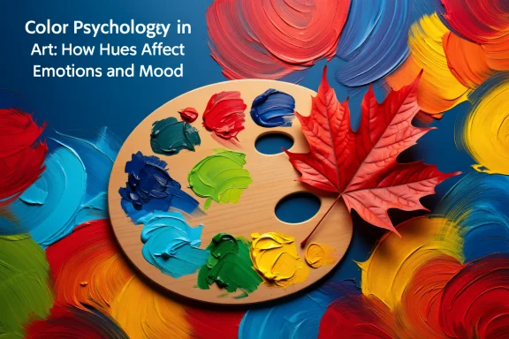
Colour is more than decoration—it’s a language that speaks directly to our emotions. From the calming blues of an ocean scene to the fiery reds of autumn maples in Québec, hues carry psychological weight that shapes how we feel, think, and behave. For artists and designers alike, understanding colour psychology unlocks the ability to influence mood and create more impactful work.
The Science of Colour and Emotion
Research in psychology and neuroscience shows that colour affects both physiology and emotion. Warm tones like red and orange can raise heart rates and stimulate energy, while cool tones like blue and green promote calmness and focus.
Key findings from studies:
-
Red: Associated with passion, urgency, and sometimes aggression. It increases energy but may also elevate stress.
-
Blue: Linked with calmness, trust, and stability. Offices and hospitals often use blue to encourage relaxation.
-
Yellow: Stimulates optimism and creativity but can cause overstimulation if overused.
-
Green: Represents balance, renewal, and nature. It has been shown to reduce anxiety.
-
Purple: Historically tied to luxury and spirituality, evoking mystery and introspection.
-
Neutral tones (white, grey, black): Provide grounding, contrast, or minimalism depending on use.
Canadian researchers in environmental psychology note that seasonal colours—like bright fall foliage or snowy winter whites—also influence emotional well-being by aligning with cultural and natural rhythms.
Colour in Artistic Practice
For artists, colour is not just aesthetic—it’s expressive. Choosing a palette deliberately can amplify the emotional impact of a painting.
Practical applications:
-
Use warm tones to convey movement, energy, or conflict.
-
Apply cool tones for serenity, distance, or melancholy.
-
Experiment with complementary contrasts (e.g., orange and blue) to create tension and vibrancy.
-
Limit palettes for focused moods—for instance, a monochrome blue series to evoke calm.
Mindful practice: Before starting a piece, reflect on the emotion you want to convey. Ask: “What colours embody this feeling?” Let the palette emerge from that intention.
Colour Psychology in Interior Design
Beyond the canvas, colour strongly influences spaces. Interior designers use hues strategically to create environments that align with purpose.
Examples in Canadian contexts:
-
Healthcare settings: Soft greens and blues promote healing and calm.
-
Educational spaces: Yellows and light oranges stimulate focus and energy.
-
Work-from-home offices: Neutral palettes with accents of blue or green balance productivity and calm.
-
Living spaces: Warm neutrals with seasonal accents (reds in autumn, cool whites in winter) help reflect Canada’s cyclical nature.
For both artists and designers, the key is balance—too much intensity can overwhelm, while too little may feel dull.
Cultural Considerations in Colour
While certain colour-emotion links are universal, cultural contexts matter. For example, in many Western traditions, white represents purity, but in some Asian cultures it is linked with mourning. In Canada’s multicultural society, being mindful of these variations ensures that artistic or design choices resonate respectfully with diverse audiences.
Exercises to Explore Colour Psychology
-
Mood palette journal: Each week, paint or collage using only colours that reflect your mood. Track how your emotions shift.
-
Seasonal studies: Capture Canadian seasonal transitions using distinct palettes—icy blues in winter, pastels in spring, vivid greens in summer, fiery reds in fall.
-
Single-hue challenge: Create an entire piece with just one colour in different values and saturations to explore its emotional range.
These exercises build awareness of how colour shapes perception both for the creator and the viewer.
Conclusion: Harnessing the Power of Colour
Colour is one of the most immediate tools artists and designers have for influencing emotion. By understanding the psychological impact of hues, we can create work that not only pleases the eye but also resonates with the heart. In a country as visually diverse as Canada—where snowy landscapes, urban skylines, and coastal sunsets inspire endless palettes—there’s no shortage of colour stories waiting to be told.
Ready to deepen your understanding of colour in your creative practice? Join a Creative Workshop at Zen Canvas Studio, where we explore the psychology of colour and its mindful application in art and design.